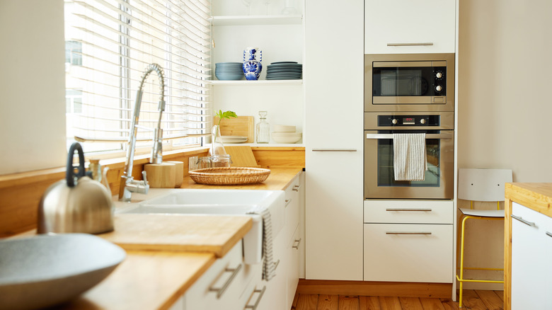
9 Best Paint Colors To Pair With White Kitchen Cabinets
The big secret about white cabinets? They go with many wall colors. That makes it easy to create the vibe you want with very little fuss, as long as you know how the paint color you're choosing complements white. With kitchen cabinets costing as much as $26,000 to replace in a 10-by-10-foot space, a lick of paint and some new accessories is a much more affordable way to upgrade a kitchen. This means that splashing out on good white cabinets may save you money over time.
White kitchen cabinets themselves are a timeless classic. Whether you choose painted wood, those '90s-style glass-fronted cabinets that are making a comeback, or sleek melamine or metal, white isn't an absence of design; it's a design hack. White cabinetry lets the rest of your kitchen speak, and you can choose what it's going to say.
If you want your white cabinets to truly pop, saturated, eye-catching colors are the way to go. Softer colors keep things a little more subtle, although you can use them to create a vintage feel or a homely, farmhouse space. Whether you're chasing trends or seeking something timeless, there are always options that complement white cabinets.
Vibrant orange
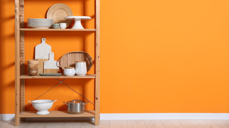
Vibrant orange brings mid-century charm to kitchens of all sizes. Fresh and citrussy with a background warmth, it's a maximalist's dream, and works well with vintage furniture finds. Wood looks great with orange, so if you have wooden flooring or window frames, it's a solid choice. If not, you could add a panelled wall or wood panelled backsplash to build a '70s time capsule. Yes, it's a statement, but the kitchen is the right place to be brave! Even small kitchens look great drenched in bright orange shades, so don't let a lack of space hold you back from combining orange and white.
Deep green
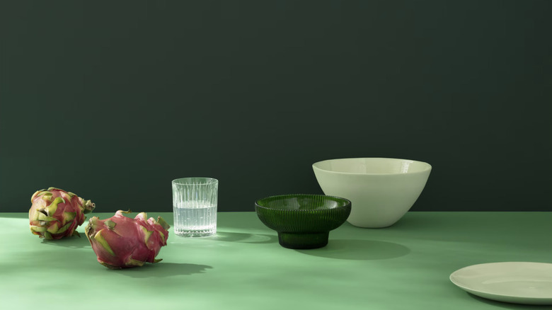
Bring all the calm of nature into the kitchen. We're all aware that the heart of the home can feel a little overwhelming at times, but deep green walls will make spaces of all sizes feel cool and tranquil, whatever might be going on. British Racing Green (a deep green which originated as a color for cars in Britain) has long been associated with a country-house style opulence in the U.K. Similar to Brunswick green and cadmium green, it's the green of billiards table baize, Hunter wellington boots, and Barbour jackets.
So, choose deep green to bring the outside in, and to hint at the idea that there might be a butler's pantry, even if you're working with a galley kitchen in a city-center apartment! Farrow & Ball's Duck Green is a good choice if you're looking for depth, as is Benjamin Moore's Essex Green.
Dark berry shades
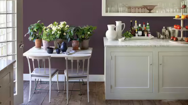
A bold choice, dark berry colors will make your kitchen feel warm, adding a richness when combined with cabinets in any shade of white. These deep purple shades look equally good with modern and classic fixtures and fittings, and will make you appear design-forward even though they're actually pretty easy to dress up.
As it makes kitchens so welcoming, a shade of dark berry is a good choice for kitchen-dining spaces, but dark, bold colors can also make small kitchens feel bigger with the right light. Sunlight in particular brings out the brightness in colors like BEHR's Rumors or Glidden's Purple Basil (a 2025 shade of the year, which you can find on Amazon), while warm lamp light enhances their darker, more sophisticated tones. You will need to think about lighting when you choose a dark purple, but it's worth it.
Bright Mediterranean blue
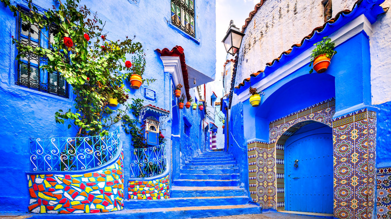
Are we in a village on the Mediterranean, or an apartment kitchen? It's hard to tell when you choose a bright blue for one or more of your kitchen walls. Blue feels clean and summery without being clinical, which makes it a great choice for a room you cook and perhaps eat in. Stay on the lighter side of bright blues if you want to create the illusion of space and pull in sunlight, and go darker for a classy, cozy feel.
Paired with large amounts of white, blue feels very Greek or North African. These are both fun design ideas to play with, whether you just want to hint at hillside villages and cats napping in the sun, or go full Moroccan souk. Simple touches can do a lot to hint at place, like curtain choice, art, rugs, and even the right pots, pans, and crockery, so you don't need to make huge changes to your space beyond paint color to bring the vacation home.
Terracotta
This classic color is deep, but muted. Think Millennial Pink, but all grown up. Even better, this red-clay hue goes with almost everything and can bring a touch of Mexico or Europe to your kitchen, depending on the rest of the decor. Add tiled countertops, bronze fittings, and playful rugs for a Mexican hacienda feel. If you want to visit the French countryside every time you step into the kitchen, lean into whitewashed freestanding furniture, wooden countertops, and maybe a vintage farmhouse sink with a skirt paired with a lighter terracotta. Despite being timeless (the clay has been used in art for thousands of years), terracotta feels ultra-modern, especially when paired with white, so keeping things super simple is also an option when you choose this sophisticated neutral.
Soft peach
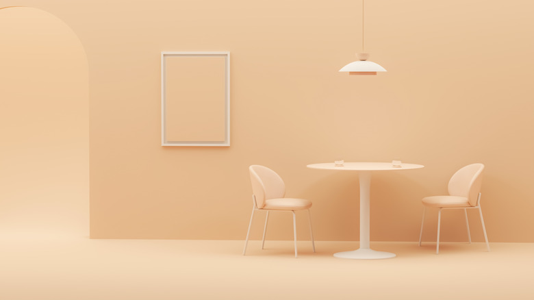
Soft peach is a joyful color, and despite being a pastel, it's anything but boring. Pair with painted wood cabinets to create a classic cottage kitchen, or bright white laminate or painted metal for a clean modern look. This color goes well with natural woods, too, so wooden floors, surfaces, or furniture will always work in a peach kitchen. Warmer and more natural than pink, peach will make your kitchen playful without seeming childish.
Glidden's Winter Peach, available on Amazon, is an all-in-one primer and paint in a delicate peach shade that leans cool, upping that grown-up feel with its subtlety. Or, to lean into the playfulness of peachy walls, choose a deeper color in the pale peach family, like Sourpatch Peach, which you'll also find in Glidden's extensive Amazon storefront.
Sage green
Sage is a reasonably broad category. It ranges from deep, warm, natural hues like this Moss Point green from Glidden to the more modern Crisp Celery from PRESTIGE, which has gray undertones. Both are available on Amazon and are designed to be applied in an easy single coat. Whether you choose a warm, natural green or a cooler hue, sage green is a pastel that's less bold than yellow or peach.
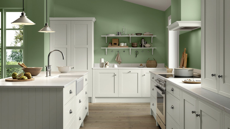
This gorgeous color is cool and easy to work with, but it's an unusual choice that adds a lot of personality to a kitchen. Sage green works very well with all shades of white, but the color of your cabinets still matters. Bright-white cabinets bring out the fresher minty tones in sage green for a more modern look, while off-white cabinets harmonize with it for a gorgeous farmhouse kitchen feel. Sage green pairs well with warmer metals like gold, tin, and bronze, so if you're updating fixtures when you paint your kitchen walls, that's the direction to lean in, and it looks great in bright morning sun, as evidenced by Farrow & Ball's light and zingy sage, Breakfast Room Green, which is designed to look its best in east-facing breakfast nooks.
Butter yellow
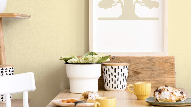
Choose light, warm yellow to create a kitchen fit for a Hallmark grandma, in a good way. Butter yellow is a cheerful, summery color when it's used correctly. When used badly, however, it can start looking like a dirty off white, evoking smoked-stained '80s motel ceilings. Avoid this kitchen design faux pas by pairing soft yellow with bright white cabinets, or combining butter hues with contrasting accents like burgundy or blackberry to make both colors pop.
Often, paint names tell their own story, and that's certainly the case with the subtler end of the yellow spectrum. Diamond Brite's delicate offering is called Yellow Linens, while Recolor's eco-friendly interior paint in a buttery yellow is simply named Summer, and PRESTIGE pushes the boundaries of buttery richness with a shade titled Delightful Yellow (all available on Amazon).
More white
Using multiple white shades is a kitchen classic, but it's not as easy as it looks. If you're painting your walls white, choosing white tile for your new kitchen backsplash, or adding white flooring when you already have white cabinets, the various shades have to complement one another. If they don't, some whites may make others look gray or yellowish. While both gray and yellow are perfectly good colors for a kitchen, you don't want white paint to appear dirty, and no one likes introducing an accidental color scheme into a kitchen redesign.
To get around this simply, use the same white consistently on your walls and your cabinets. If you're confident in your color-matching skills, you can also pair whites with similar undertones. This is easiest with warmer shades like creams and grays, and choose at least three whites so that it doesn't look as if you've tried and failed to match your walls to your cabinets. A simple trick to achieve this is painting the ceiling as well as the walls; this is the one place bright white always belongs, as it opens up the space and creates contrast with warmer, creamier tones.
