10 Of The Most Controversial Food Rebrands Of All Time
There comes a time in every established brand's life when its executives call for a rebrand. It can be as small as an updated color scheme, or as big as an entire overhaul. Either way, the objective is the same: Reposition the brand in a way that entices new consumers, while holding fast to loyal followers. The balance is tricky to strike, especially for big names with big fanbases. The stronger the brand, the more people will be attached to old design elements, and thus reluctant to let them go. The risk is high, but so is the potential reward.
In today's saturated and highly competitive market, it's harder than ever for food and beverage brands to fight for market share. In every category, it seems, buyers are inundated with choices, each one promising to be tastier or healthier than the last. Add the economic struggles that force them to cut costs — not to mention post-pandemic supply chain issues — and food brands must make bold moves to remain fresh and attractive. Some have remade themselves over several times, with mixed results.
While everyone loves a comeback, a rebrand is something else entirely. They've been known to spark debate, create contention, and even ruin household names. These are some of the most controversial examples.
Dunkin' Donuts dropped the donuts
In 2018, Dunkin' Donuts decided that it wanted to be known for more than its signature deep-fried treats, and announced that it would thus drop the second word from its name. This wasn't the first time the company underwent a rebrand; The restaurant chain started as Open Kettle in 1948, but renamed Dunkin' Donuts two years later, after Founder Bill Rosenberg spoke with some executives. Despite this history, the 21st-century rebrand felt revolutionary, and public reception was mixed.
Across social media, fans mourned the loss of a familiar name, and even voiced feelings of betrayal. However, Dunkin' (as it's officially been called since the start of 2019) stayed strong in its conviction, and true to the rest of its branding. The colors, the fonts, and even the recipes for the best donuts at Dunkin' remained unchanged, and this seems to have placated the naysayers.
Meanwhile, the rebrand allowed Dunkin' to expand its other offerings, and it's now the second-largest coffee shop chain in the U.S. Sure, people still go for donuts, but they also love the company's breakfast sandwiches, combo deals, and the ability to create their own coffee drinks. In the end, for this brand, reinvention was the right choice.
Weight Watchers changed to WW
Once a respected leader in the healthy-eating industry, Weight Watchers built its success on the diet culture that dominated the 20th century. However, by 2015 this brand was no longer a trusted source for nutritional information, and was losing subscribers at a shocking rate. In an attempt to regain its customer base, the company launched Weight Watchers meal kits, but it was apparent that it needed to do more. Like so many of its customers, Weight Watchers suspected it needed to make a major change if it wanted to improve its image.
To distance itself from any perceived body shaming, Weight Watchers was rebranded to WW. It had a new logo, a new tagline, and a new ethos around healthy eating, this time focused more on holistic wellness than overtly counting calories. It even revamped its proprietary points system, calling it Freestyle, to evoke feelings of ease and flexibility.
While the makeover worked somewhat to revive the legacy brand, bringing it back into the realm of respectability, not everyone agreed with the new look. One customer even started a petition to get WW to revert to its previous points system. But the real controversy came when WW promoted its branded hashtag #thisismyWW on the same night that concerns over an impending World War (or WW) were running rampant on social media — probably not something the company anticipated when it chose its new name.
Starbucks took the coffee out of its logo
From accusations of gentrification to reversing popular policies, Starbucks is no stranger to controversy. Back in 2008, though, its biggest scandal centered on a reimagined logo. To celebrate its 40th anniversary, Starbucks unveiled a more intricately detailed version of its now-famous siren, meant to be harder for other brands to replicate. Consumer backlash was swift, prompting Starbucks to try again. In 2011, it brought back the original logo, minus the text that previously read "Starbucks Coffee."
Instead of clearly proclaiming Starbucks as a coffee shop, the rebrand banked on people already knowing that. Fans hailed the move as bold, while skeptics called it confusing. Some speculated that it would ultimately hurt the brand, but over a decade later, Starbucks is bigger than ever, even as negative sentiment grows.
Curiously, in 2025, Starbucks made another change, and it's one that could be seen as contradictory to the 2011 rebrand: While the company's legal name is still Starbucks Corporation, it's begun to refer to itself as The Starbucks Coffee Company on its website and app, as well as in ads. It seems like the company is trying to remind the public of what put it on the map. Considering our collective fondness for Starbucks' Pumpkin Spice Latte, that seems unnecessary. However, Starbucks is the largest coffee brand in the world, so we can assume it knows what it's doing.
Coca-Cola gave us New Coke
At the height of the great Cola Wars of the 1980s, Pepsi launched an ingenious marketing campaign. The "Pepsi Challenge" pitted its signature soft drink against Coca-Cola's in blind taste tests across the country, successfully proving that it had the preferred recipe. The newcomer was finally encroaching on Coca-Cola's market share, and Coke was running scared — right into an identity crisis.
In a desperate attempt to regain its dominance, Coca-Cola hatched a risky plan. The company reformulated its 99-year-old recipe to be closer to its rival's, made a show of locking the previous formula away in an Atlanta bank vault, and proudly announced that it would now sell only New Coke. The company was all-in on its "new and improved" beverage, ready to completely do away with the one its fans were used to.
The public outcry was swift and furious, with Coca-Cola's corporate offices reportedly fielding 5,000 angry phone calls per day. Meanwhile, executives at Pepsi gave its employees the day off to celebrate a surprise victory. To this day, the New Coke disaster is widely considered to be one of the biggest marketing blunders of all time, often recalled by nostalgic soda drinkers. Coca-Cola was forced to pivot again, this time retracing its steps. It reverted to its previous recipe, and reintroduced the beverage as Coca-Cola Classic, which is how it's still enjoyed today.
Pizza Hut got a total makeover
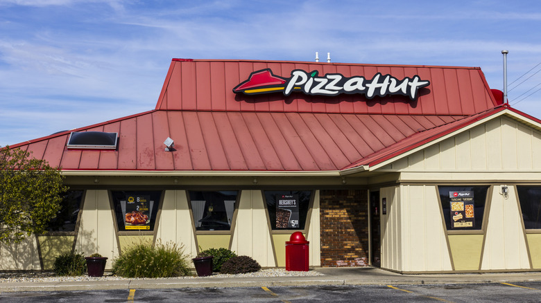
In 2014, nearly 60 years after being founded, it was Pizza Hut's turn for a refresh. The restaurant chain was given a total makeover, complete with a new logo and updated menu. The rebrand was the result of extensive research, particularly into the dining habits of younger Americans. These were the days of gastropubs and mixologists, and Pizza Hut tried its best to fit in with trendy dishes like a Cock-a-Doodle Bacon Pie with balsamic drizzle, and the now-discontinued Boom Boom crust.
One of Pizza Hut's biggest rivals, Domino's, had recently experienced a similar transformation, airing commercials that comically addressed common criticisms. With messaging that skewered the fast-food pizza industry as a whole, Pizza Hut's approach felt even more ambitious. Its ads featured elderly Italian customers weighing in on futuristic flavors, emphasizing the fact that this was a rebrand for millennials. Unfortunately, those millennials weren't convinced, and Pizza Hut's sales continued to drop. It appears the outdated color scheme was never the issue, and the gourmet rebrand was declared a major flop by public opinion.
Five years later, Pizza Hut admitted defeat when it brought its old logo back. It continues to test new marketing ploys, going so far as to launch Tomato Wine by Pizza Hut — which is weird, but not too surprising, given that this is the same company that once tried to get the Pizza Hut logo on the moon.
Hershey redesigned its logo
In 2014, The Hershey Company hit the fan when it unveiled a controversial new logo. In an obvious attempt to appear more modern, the company had updated its font and flattened its signature chocolate kiss, transforming it from a more realistic 3D image to a stylized 2D graphic. The new look was bland and corporate, and would have been disappointing at worst, if it weren't for the fact that the kiss now clearly resembled the poop emoji.
Online observers were quick to point out the similarities, leaving many to wonder how such a big brand had made such a big misstep. In its effort to take an old-school icon into the 21st century, the company had completely overlooked a key cultural touchpoint on everyone's phones.
Fans of the new branding shrugged off criticisms, chalking up the dirty jokes to the fact that humans looking for inappropriate images will always find them. But that didn't stop those jokes, making the new Hershey logo one of the most hilariously controversial food rebrands of all time. It stank so bad that, a decade later, TikTokkers continued to make fun of it. Despite the backlash, though, Hershey hasn't backed down, and the questionable logo remains on its website today.
SunChips introduced compostable bags
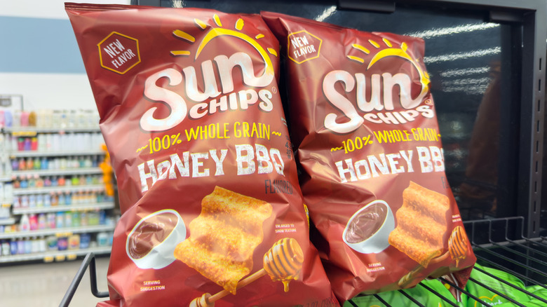
When Frito-Lay's SunChips introduced the world's first 100% compostable packaging to the market in 2009, it seemed like a win for everyone. Fans could now indulge their crunchy, salty cravings without contributing too much to the pollution of our planet. The only problem was that they might hurt their hearing in the process.
SunChips' eco-friendly bags were loud, and not just a little. They produced a startling, metallic crinkle in the consumer's hands at a volume which some compared to a running motorcycle engine. They were so loud, the jokes practically wrote themselves — but you wouldn't have heard them over the sound of the bag. Indeed, a Facebook page called Sorry But I Can't Hear You Over This Sun Chips Bag was created, and it still has nearly 40,000 followers.
The shiny, noisy, compostable bags were made entirely from plant products, with over 90% being polylactic acid, a polymer made of fermented starch extracted from corn. The material was the product of 4 years of research, and would (according to SunChips ads) completely decompose within 14 weeks. Compare that to the 400 years it will reportedly take petroleum-based materials to break down, and you may be sad to learn that SunChips' revolutionary rebrand failed. Sales dropped and, despite good intentions, the company was forced to revert to plastic. Here's hoping it tries again someday to lessen the environmental impact of the best SunChip flavors, at a quieter volume.
Aunt Jemima became Pearl Milling Company
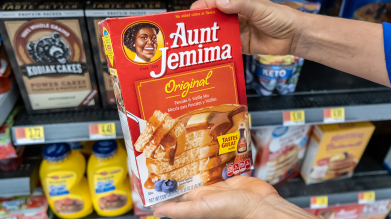
Here's an example of a controversy that actually ended with a rebrand. After countless accusations of perpetuating harmful racial stereotypes, in 2020, Quaker Oats and PepsiCo announced that it would finally do away with Aunt Jemima. The illustrated mascot, modeled after an enslaved storyteller and cook, took its name from an old minstrel song. As American culture evolved in the century after 1890, when the logo was created, the public questioned the message behind the brand.
The criticism reached new ears in 2015, when an opinion piece published in The New York Times begged the Quaker Oats Company to retire Aunt Jemima, comparing it to the Confederate flag and calling it "very much linked to Southern racism." High-profile advocates, including the husband of late restaurateur B. Smith, joined the cause, and a TikTok video denouncing the brand as racist went viral, earning several million views.
The controversy ultimately became greater than the company could bear. In 2021, Aunt Jemima products were officially rebranded to Pearl Milling Company, named after a local flour mill famous for its self-rising pancake mix. Along with its new branding, the company unveiled a pronged plan to invest in the Black community. While some may miss the smiling face of the outdated logo, most consumers seem to agree that the move was the right thing to do.
Uncle Ben's transformed into Ben's Originals
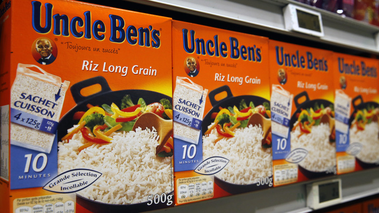
In September 2020, Mars Food announced that it would be rebranding Uncle Ben's Rice to Ben's Originals. The move was part of a larger plan, unveiled earlier that year, to evaluate its family of brands in response to mounting cultural pressures.
For years, Uncle Ben's faced criticism for its recognizable logo, which featured the friendly, servile face of a Black head waiter in 1947 Chicago. The name was supposedly inspired by a Texas rice farmer, but the issue lay in the use of the word "uncle," which was long used to demean older Black Americans in the South. After decades of being the best-selling rice brand in the U.S., Uncle Ben's had to finally get with the times.
The company's first attempt at pacifying detractors occurred in 2007, when it tried to recast Uncle Ben as chairman of the board. When that glow-up didn't work, executives realized that it was time to retire the insensitive icon altogether. Along with a total rebrand, Mars unveiled plans to partner with the National Urban League to help aspiring Black chefs, showing that it was committed to making amends. Ben's Originals hit store shelves in 2021, signifying the end of an era, and the beginning of a more equitable boxed dinner brand, complete with new flavors.
Cracker Barrel launched a short-lived rebrand
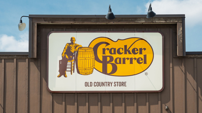
When Tennessee restaurant chain Cracker Barrel Old Country Store decided to swap out its kitschy branding for something new, it could not have predicted the firestorm it would ignite. Who knew that people were so attached to Uncle Herschel, the old-timey mascot leaning good-naturedly against a barrel since 1977? Well, they were — and they were not happy when the company proudly announced his removal in favor of a 21st-century aesthetic.
Cracker Barrel's 2025 logo is a simple, vaguely barrel-like shape in the brand's harvest yellow, prominently displaying its name in a slimmed-down version of the old font. It's sleek and contemporary, if a bit boring without Uncle Herschel or his old-fashioned Southern charm. The updated brand looks similar to others of this era, corporate and clean, intentionally designed to avoid controversy. It's ironic, then, that controversy is precisely what it sparked.
Across social media, fans revolted, decrying the rebrand as sanitized, soulless, and occasionally, "woke." While other brands have weathered similar changes without issue, it appears that Cracker Barrel misread the moment, or the wishes of its target demographic, or both. A unique combination of cultural tensions fanned the flames online, and Cracker Barrel's stock tanked. Within days of its value dropping by almost $100 million, the company caved. To conclude what may be the briefest rebrand in history, Cracker Barrel issued an apology, canceled plans to renovate, and reverted to its old branding, Uncle Herschel and all.

